Menu
Sales Analysis Dashboard
Introduction:
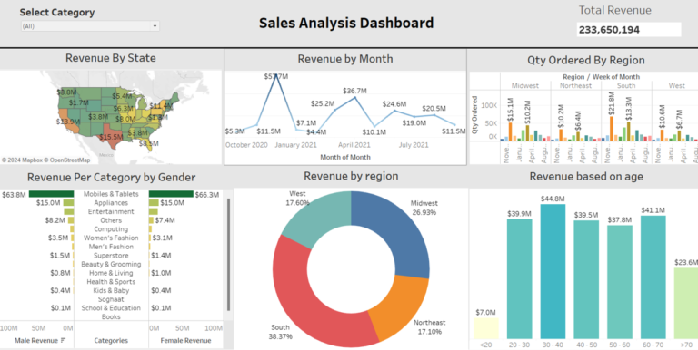
This dashboard aims to provide a comprehensive analysis of sales data, focusing on various aspects such as revenue distribution across states, months, age groups, regions, and product categories by gender. The analysis aims to identify key trends and patterns in revenue generation and product demand, which can help in optimizing marketing and sales strategies.
Data Collection
The dataset encompasses a wide range of features, including ‘Zip code’, ‘City’, ‘County’, ‘Gender’, ‘Category’, and ‘Payment Method’. Using these features, the primary objective is to develop visualizations that consumers are most likely to choose when making a purchase decision.
Sales Analysis Dashboard Visualization:
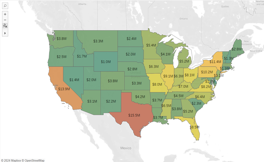
Revenue by State:
- Purpose: This section of the dashboard focuses on understanding the revenue distribution across different states.
- Visualization: The data is represented on a map or heatmap where each state is color-coded based on the amount of revenue it generates. Darker shades indicate higher revenue, while lighter shades indicate lower revenue.
- Insights: From this visualization, it’s evident that southern states, particularly Texas, Florida, and California, generate the most revenue. This information can be crucial for deciding where to allocate more resources and marketing efforts to maximize returns.
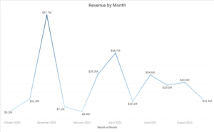
- Purpose: This chart helps track how revenue fluctuates throughout the year, identifying peaks and troughs.
- Visualization: A line graph is used to represent monthly revenue trends over the past year.
- Insights: December 2020 saw the highest revenue, likely due to holiday shopping. Additionally, there are significant revenue peaks in April and July 2021. This information is valuable for seasonal marketing strategies and inventory management.
- Purpose: This part of the dashboard breaks down revenue by geographic regions (e.g., South, Midwest, West, Northeast).
- Visualization: A pie chart is used to show the proportion of total revenue generated by each region.
- Insights: The South generates the highest revenue, accounting for 38.37% of the total. The Midwest follows with 26.93%, the West with 17.60%, and the Northeast with 17.10%. These insights can help in regional marketing and resource allocation, focusing efforts where the most significant returns are seen.
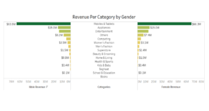
- Purpose: This analysis examines how revenue from different product categories varies by gender.
- Visualization: A bar graph categorizes revenue by product type and further splits it by gender.
- Insights: Both men and women generate the most revenue in the Mobiles and Tablets category, followed by Appliances and Entertainment. There are notable differences in categories like Men’s and Women’s Fashion, indicating a need for gender-specific marketing strategies in these areas.
- Purpose: This part of the dashboard breaks down revenue by geographic regions (e.g., South, Midwest, West, Northeast).
- Visualization: A pie chart is used to show the proportion of total revenue generated by each region.
- Insights: The South generates the highest revenue, accounting for 38.37% of the total. The Midwest follows with 26.93%, the West with 17.60%, and the Northeast with 17.10%. These insights can help in regional marketing and resource allocation, focusing efforts where the most significant returns are seen.
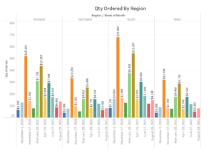
- Purpose: This chart tracks the number of items ordered in different regions, broken down by week of the month.
- Visualization: A bar graph shows the quantity ordered by region over time.
- Insights: The South region again stands out with the highest quantity ordered, particularly in December 2020. There are also noticeable peaks in other regions during various months. This information can be used to optimize inventory management and ensure that high-demand regions are adequately stocked, especially during peak periods.
Recommendations:
Based on the insights gathered, the dashboard suggests several strategic actions:
- Target High-Revenue Areas: Focus marketing and sales efforts on states and months that show higher revenue.
- Age-Specific Marketing: Tailor marketing to the 30-60 age group, which contributes the most to revenue.
- Regional Focus: Increase market presence in the South while exploring growth opportunities in the Northeast and West.
- Gender-Specific Strategies: Develop targeted marketing approaches for categories with distinct gender differences.
- Prepare for Peak Demand: Ensure adequate inventory and plan promotions to coincide with high-demand periods in key regions, particularly the South.
Conclusion:
- The significant revenue trends across different segments—states, months, age groups, regions, and product categories by gender. It underscores the importance of focusing on high-revenue areas and tailoring strategies based on demographic insights to enhance sales performance. The analysis points to clear opportunities for optimization, especially in targeted marketing and supply chain management.
